Improving user engagement with a Chrome Extension
Sep. 2024 - Oct. 2024
Customers were not engaging enough with our customer support product, one of our primary growth sources in our revenue forecast.
We identified that our product required more behavior change than customers were willing to make.
We launched an experimental solution aimed at creating faster value for new users while making them more reliant on our product.
Due to my non-disclosure agreement, I have left out some specific metrics and swapped them for percentages where it made sense.
My Role
I led all design activities as the primary designer throughout the project, collaborating with the product manager and engineering lead.
Our team was entirely remote throughout this project.
The Challenge
We were banking on our customer support product as one of our primary means of increasing revenue in our growth forecast.
Users of this product were not engaging with it as much as we would expect from an email/phone product. Many of them were a churn risk, which threatened to derail our growth plan.
We were tasked with learning why these customers were not adopting the product, and producing a solution that would increase the engaged customer count by at least 10%.
We had 8 weeks to identify, develop and launch a solution.

The Approach
Our product manager on the project was new to the company, so she and I planned to collaborate heavily together in all phases of the project so I could share context.
I would take a lead role in defining requirements with help from the PM.
To streamline our process, we assigned one of the engineers on our product squad as tech lead, the point of contact for any feasibility and technical input.
We planned to look for any ways engineers could get a head start on development work to maximize the short timeframe we had to ship a solution.

Audience
Customers who canceled the product
Business owners and their employees
We needed to hear from customers who had either canceled the product altogether, or were struggling to adopt it currently.
We also needed to hear from business owners and employees. We knew from talks with several business owners that they were ready to switch to our product, but their team was not.
—
We chose a qualitative approach because the question we were answering was still so open ended. We didn’t want to make too many unvalidated assumptions early on.
Customer engagement was already being tracked in a spreadsheet, so it was easy to target specific accounts that matched this criteria.
Historically, these segments were difficult for us to get feedback from—my theory is they assumed we were trying to sell them something—so we needed to think hard about how to get them to schedule an interview.
To combat this, I crafted an email template that was personalized based on their usage–”I see you canceled our customer support product recently…”. I asked if they would be willing to “share their experience with us” so we could improve the product, to avoid “salesy” language.
Surprisingly, around 50% of customers we contacted wanted to talk to us! A big win for this segment.
Defining a Hypothesis
“Behavior change is the largest factor preventing successful adoption of the product. If we can reduce the need for behavior change, customers will engage more with the product and get more value."
Based on dozens of past conversations I, and our customer success team, had with customers, we knew they were very averse to change in how they did their work.
We also knew that compared to Gmail and Outlook–the two most commonly used products for this use case by our clients–our product required a lot of behavior change to be successful.
Our hypothesis was, “Behavior change is the largest factor preventing successful adoption of the product. If we can reduce the need for behavior change, customers will engage more with the product and get more value.”
Our product was trying to streamline customer support for property management companies across all their communication channels. We weren't trying to be Gmail or Outlook.
We were trying to do something Gmail and Outlook would never do, in providing the specific tools that property managers needed to manage all their customer support tickets.
This meant our product had a different feature-set than Gmail and Outlook, and required a bit of a learning curve as a result.

A note from one of our interviews. Customers had the expectation that our product was just a better Gmail/Outlook; a perspective we ultimately wanted to change.
Insights & Learnings
After around 8 fresh interviews and reviewing recordings of several recent ones, we came to the conclusion we were on the right track.
Users struggled to recreate their communication habits from Gmail or Outlook in our product, even though we did support most of these habits.
Customers were afraid of changing their email configuration, which our product required them to do. Most companies communicated with their customers using individual email addresses for each team member, while our product encouraged them to use shared addresses.
If users could keep using their existing email tool with added features, they would. They weren't fundamentally frustrated with Gmail or Outlook. They just didn't do everything they needed them to for the customer support use case.
Employees often didn't understand the value our product was going to create for them, so they were reluctant to change their habits to use it.

Insights from a customer interview that reinforced how our product's learning curve made it difficult to adopt.
I collaborated with the product manager to define the solution requirements.
The requirements became pretty clear in customer interviews:
It needed to solve a key problem for the business owner and the employee to ensure companies would successfully adopt it.
Needed to create almost immediate value for the user with as minimal set up and behavior change as possible.
Ideation and Iteration
I got into Figma and explored several ways we could meet these requirements.
Option 1: Mimic the design and feature-set of the products customers already use–Gmail and Outlook—in our product
In theory this would eliminate the need for behavior change, but it could take months to get anywhere close to feature-parity with these products, especially with a 3-person engineering team
"Just make our product like Gmail!"
Option 2: Augment Gmail and Outlook, instead of requiring users to learn an entirely new product.
If we could let users continue using the product they were accustomed to, but augment their experience with useful features they couldn’t get in Gmail/Outlook, we could create more value with less behavior change and make them more reliant on our product at the same time

Option 3: Redefine what a “shared email address” means so it doesn't require users to completely change how they organize their email channels.


Option 4: Create immediate value for users when they sign up for this product by giving them immediate reporting and insight into their response times - something they don’t get from Gmail or Outlook.
All users would need to do is connect their Gmail or Outlook accounts and a few seconds later we could give them insight into their team’s response time
No behavior change would be required because it doesn’t touch their daily email habits directly.

At this stage, I did a mix of low-fidelity wireframes and mid-fidelity mock ups. The extra detail of mid-fidelity helps me find design challenges that are easier to overlook in low-fidelity.
Validating with Users
Before we went further, we wanted to validate if customers would get excited about any of these solution concepts.
The PM and I contacted some of the same customers we had spoken to previously, showed them the low fidelity concepts and received positive responses about a combination of Option 2 and 4.
#2 Augment their Gmail so they could keep using it
#4 Give visibility into conversations and response times across individual inboxes

We got enough positive reactions from customers that we decided to combine options #2 and #4.
The concept was split into 2 parts:
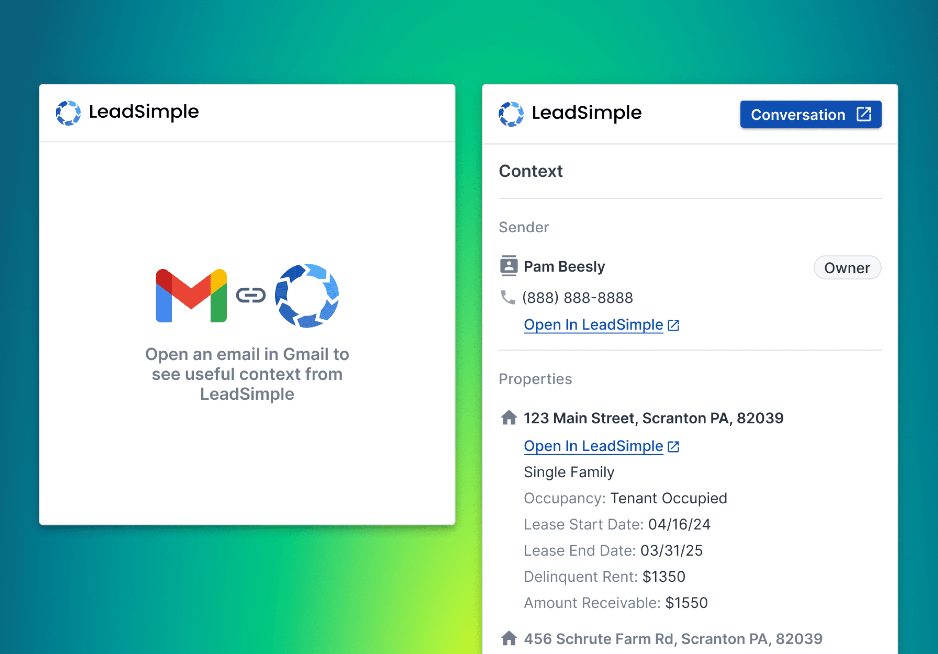
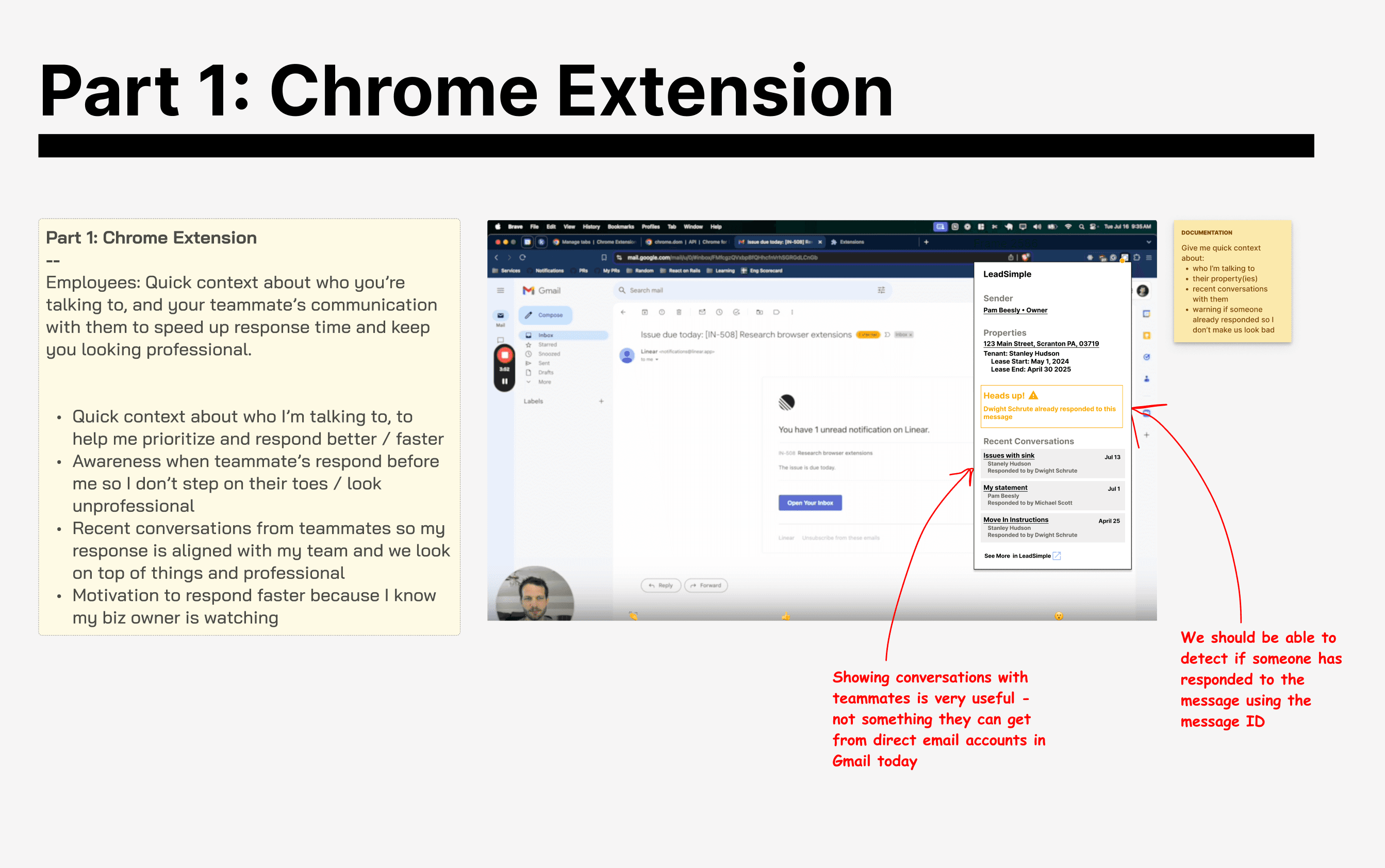
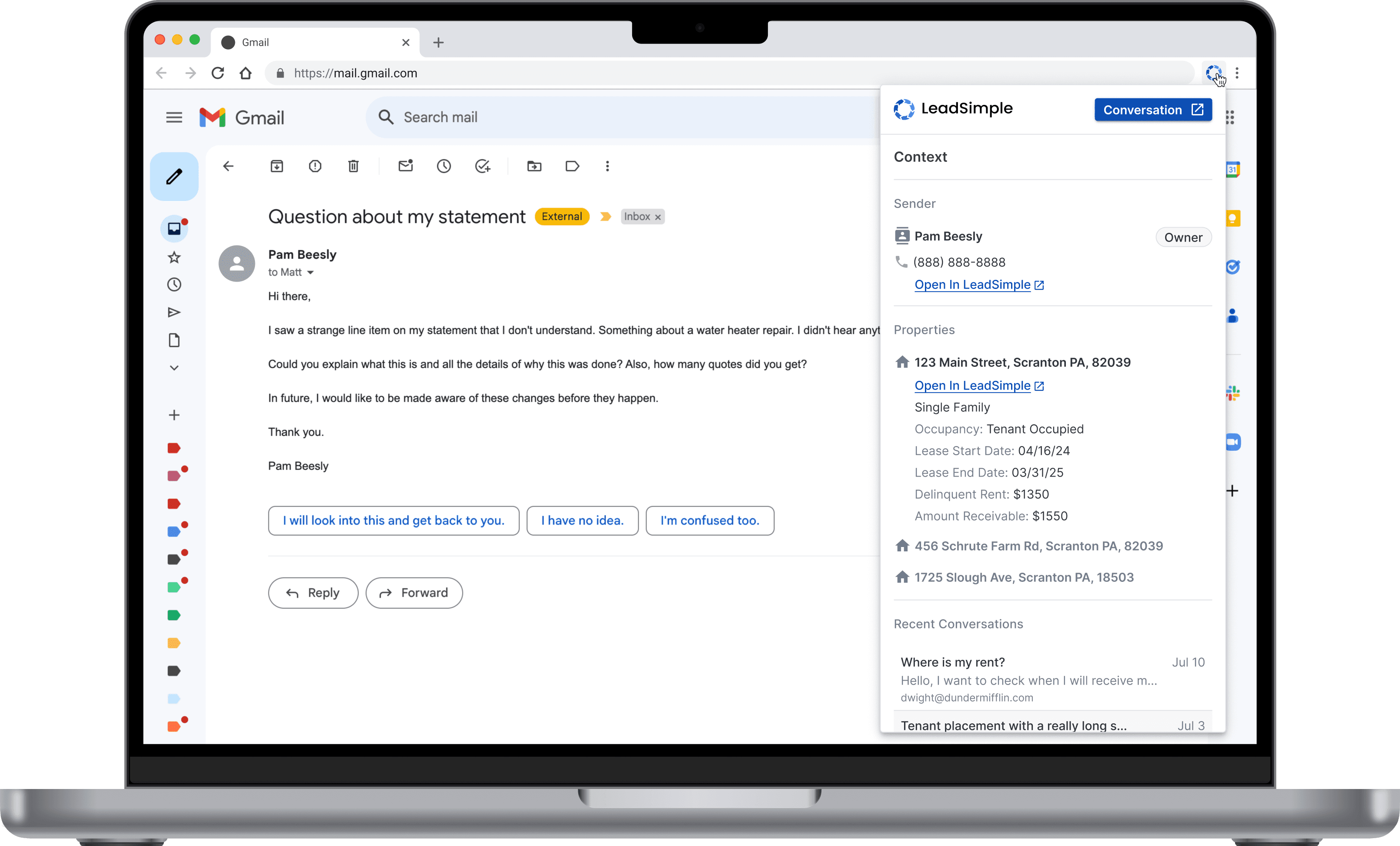
A Chrome extension that allowed employees to keep using Gmail. It would display context about the customer, rental information and previous conversations with that sender, whenever the user opened an email in Gmail. This context would help the user respond faster.
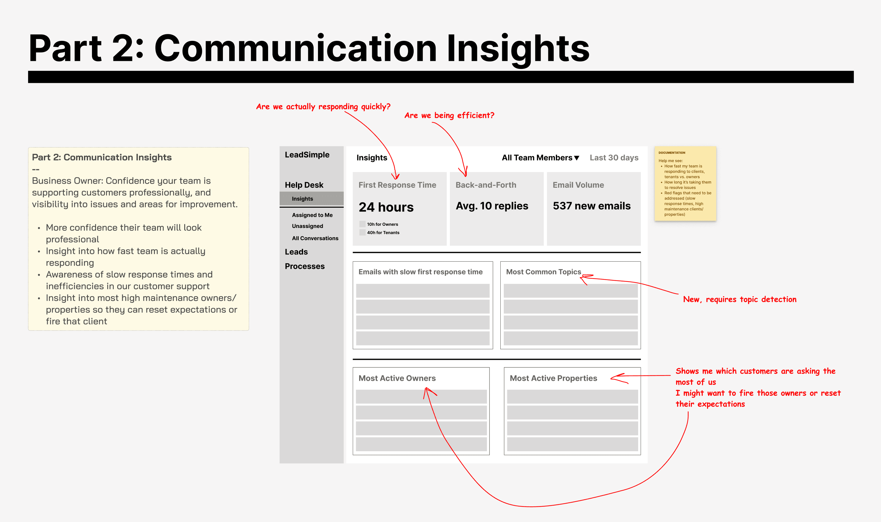
Communication insights give the business owner visibility into the response time for each team member and type of client. This would be available shortly after they connected their Gmail/Outlook account to our product so set-up was minimal.
" For the experiment, we limited scope to a solution that worked for Gmail and was optimized for desktop initially."
Our tech lead did some digging and found it would take too much time to build a solution that would work for Gmail and Outlook.
At this point, we had 1 engineer who could work on this full time. The other 2 were tied up with other roadmap work.
Since over 65% of our customer base used Gmail, we decided to limit the scope to a solution that worked for Gmail. If it worked, we could expand to our Outlook users later.
We also decided to optimize the solution for desktop initially since most of users used this product primarily from their desks.
Defining Scope
In interviews, we found 2 main customer-support problems users wanted solved.
Employees: "As a customer support person, I need context about the customer I'm talking to and visibility into what teammates have said to them so I can respond faster."
Business Owners: "As a business owner or manager, I want more visibility into what my team is saying to customers and how fast they are responding so that I know they are upholding quality standards and I can correct any shortcomings."
I always like to frame user needs from their perspective. It keeps us in the user's shoes as a team so we stay "married" to their challenges, not our solutions.
We had gathered specific requests from customers for both aspects of the solution in the interviews.
We prioritized what to include by:
What was most highly requested by users
Time it would take to build
How much impact we thought they would make in helping users adopt

Design Challenges
At this point, we entered into info architecture and visual design.
Positioning the Chrome Extension
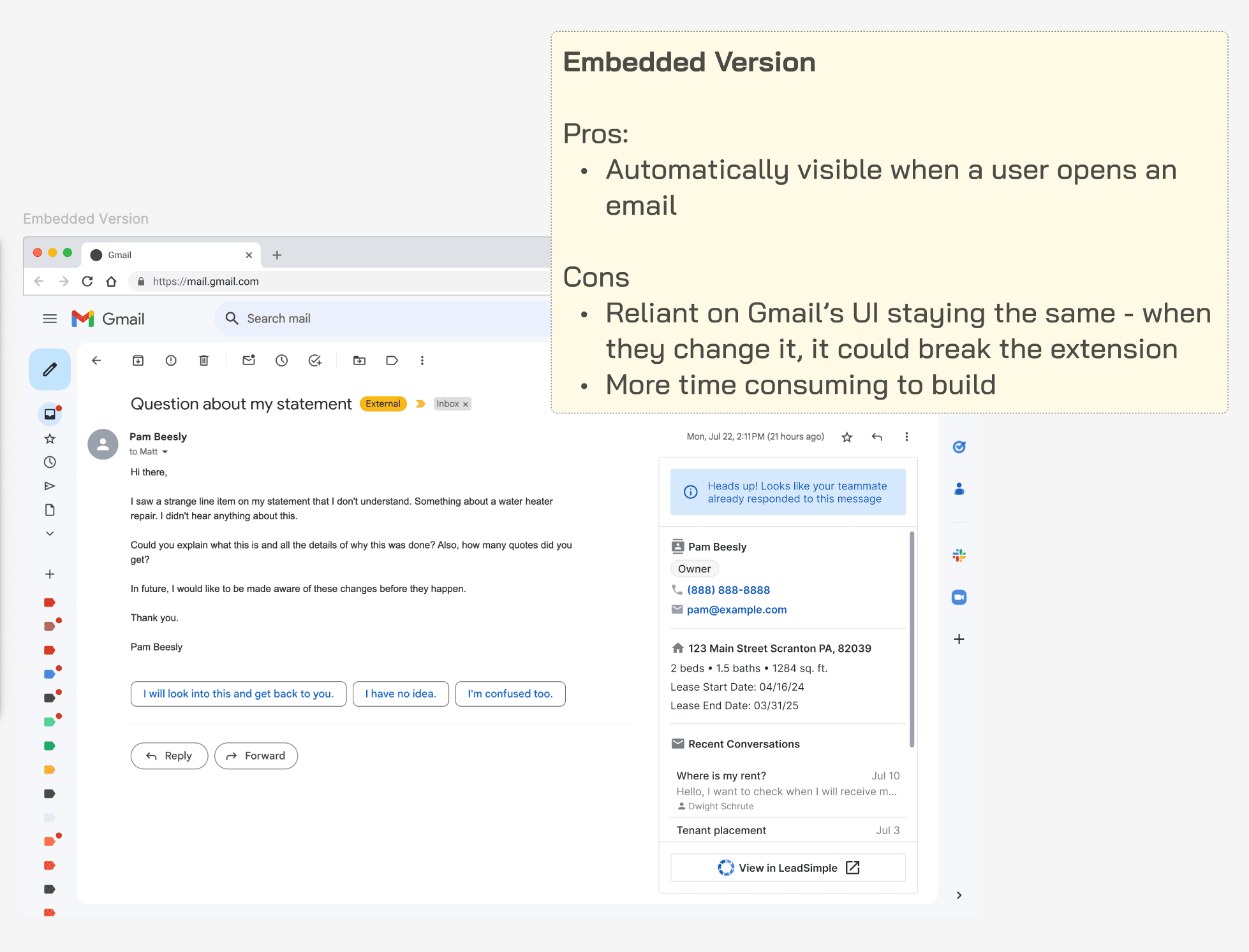
Ideally, we could embed this information within Gmail so the user wouldn’t need to open the extension every time they wanted to see the information.
We chose the non-embedded version for the sake of time. This was an experiment; the faster we could launch and get it in real customers hands, the faster we could learn.

Prioritizing Information
The Chrome extension had limited space to display information. We had to prioritize what context was most critical.
We also had to decide how much information to display to be useful and also avoid asking the user to scroll too much.

Where to Put "Communication Insights"
Where in the product did the "communication insights" features belong? Long term we wanted to offer a more robust dashboard and insights for customer communications, but the initial version didn’t justify having an entire page dedicated to it.
For the short term, we chose to locate them on our new Dashboard screen with the long term vision of creating a dedicated screen for them as we expanded the feature-set.

Final Validation
Before front-end development began, we presented mockups to several of the customers we had previously spoken to to ensure we weren’t missing anything big.
They pointed out some areas for improvement and some future requests for it, but overall results were very positive.
Chrome Extension


Communication Insights

A new section of the existing Dashboard feature gave customers visibility into their response time a few minutes after they connected their email accounts.

We added a feature allowing users to create a response time goal.

The chart would indicate when a user was off track compared to their goal or within it. It also prompted them to set a goal if they didn't have one.