Increasing new-client retention by 55% with a performance dashboard
June 2024 - July 2024
To achieve our revenue targets, we needed to increase customer retention.
We launched a business performance dashboard in 8 weeks to demonstrate the value of the product so customers would stick with us long enough to finish implementing it in their businesses.
Post launch we saw a 55% increase in engagement from new customers and a similar increase in retention.
Due to my non-disclosure agreement, I have left out some specific metrics and swapped them for percentages where it made sense.
My Role
I led all design activities throughout the project with another designer, including:
I worked alongside the product manager and engineering lead to:
Clarify and cut scope when needed - To fit within time constraints, we needed to make strategic scope cuts without sacrificing the value of the end-product
Align stakeholders - It would take a joint effort from all departments to successfully impact retention. I facilitated and participated in keeping stakeholders from Sales and Customer Success up to date and ensuring alignment with the direction.
Manage the project timeline - Engineering and design would need to overlap to ship by the deadline. I helped identify when engineering could start once enough of the scope was clear.
Handoff technical details to marketing for the launch
Our team was entirely remote throughout this project.
Early stage wireframes, exploring ways to organize data.
The Challenge
The business was behind on our recurring revenue targets. Customer retention was a key factor in this. If we could increase retention by at least 5%, we estimated this would play a significant role at getting recurring revenue back on track.
This was a joint effort between Product and Customer Success.
We had 8 weeks to ship a solution to impact retention before our next major marketing launch. This time frame included design, engineering, and a closed beta period.
The Approach
Due to the tight time frame, engineering and design would need to run simultaneously. We planned to get clear on the scope as early as possible to leave as much time for engineering and beta as we could.
We also needed to land on a feasible scope as soon as possible. We would need regular check-ins with the engineers to gather feedback on our solutions.
—
Successfully improving retention was a joint effort across all departments. We were going to need to collaborate closely with Sales, Customer Success, and Marketing to:
Gather insights from their customer interactions
Gut check our solutions to ensure they aligned with their knowledge and experiences with clients
Align on the technical details so they were equipped to evangelize the end-product post launch
LeadSimple is comprised of 4 distinct products: CRM, Process Management, Customer Support/Ticketing, Integrations.
Our target market was property management companies–typically small businesses with 2-20 employees.
The product suite helped them organize and manage all their critical business processes and customer communications in one place.
The industry has generally been slow to adopt software to streamline their businesses, so many clients needed extra help after signing up to ensure they implemented the product correctly. Our customer success team led implementations for every new client that ranged from 3-8 weeks in duration.
Defining a Hypothesis
"If we could visualize how LeadSimple will improve the business metrics clients care most about, they will be more motivated to stick with their implementation until they get the full value of the product.”
From previous customer research, we had found that new customers would come to us with a vague sense of the challenges they needed to solve in their business
• ”I don’t know what my team is doing”
• “we miss critical tasks and our customers leave frustrated”
• “I’m so busy I can’t take a vacation”
After they purchased our product, it was difficult for them to visualize how LeadSimple was going to resolve their issues for them and/or achieve the business outcomes they cared most about.
During their 3-8 week implementation, customers would start to wonder “what am I doing this for again?”. Sometimes they would pause their implementation indefinitely or cancel the product altogether.
We started with this hypothesis: “if we could visualize how LeadSimple will improve the business metrics clients care most about, they will be more motivated to stick with their implementation until they get the full value of the product.”
Example of notes I took during customer interviews. FigJam paired with Grain.app is one of my favorite ways of taking notes.
Customer Research
I led a number of qualitative customer interviews with existing and new clients, alongside a fellow designer, to validate our hypothesis:
What are the business metrics property management business owners care most about?
If we could show them how LeadSimple improved business metrics they cared about, would they be willing to stick with LeadSimple until they finished implementing it?
We documented metrics and mapped them to the questions customers were trying to answer with those data points. This would become useful later in deciding what charts would visualize the data best.
Audience
New customers struggling with their implementation
Business owners or operations manager personas
I worked with the product manager and our Customer Success team to identify and reach out to new customers, specifically ones who were struggling with their implementations.
The temptation was to interview existing clients who were already using the product regularly since they were usually more interested in giving us feedback. But we needed to target new clients who were early, or in the middle of, their implementation phase to validate our hypothesis.
We were able to talk to a few clients in this segment, but most didn’t respond or simply weren’t interested in giving us feedback.
To supplement, we also targeted several property management consultants in the industry who had vast experience helping property managers implement platforms like ours, and had experience running their own businesses.
They were one step removed from our target segment, but we found their insights were in agreement with what we learned from our target.
What We Learned
After a few interviews, we came to the conclusion we were on the right track.
We validated that customers struggled to see exactly how LeadSimple would impact these business goals and metrics
We quickly identified the metrics users cared most about
Many of these metrics could be directly impacted by the product, provided they were actively using it
Simply displaying the metrics would not be enough. We needed to help users answer their specific questions with the data
Users wanted to be able to track this data on the go and in real time, not only at their desk
Using the insights we gathered, I worked with our product manager to define requirements for the solution.
Apart from the business goal of improving retention, our solution needed to:
Create a compelling visual connection between these metrics and the user’s usage of LeadSimple - this would be critical to making the dashboard successful in its stated aim
Do a great job of answering the customer’s specific questions with each metric - we couldn’t just spit out data and expect the customer to put the pieces together
Be usable on mobile, not just desktop
Allow users to drill down into the data to understand the “why”, what caused it to be this way so they could identify ways to course correct
Ideation and Iteration
I collaborated with another designer to quickly produce as many solution concepts as possible in a 1-week timeframe.
We started with low fidelity concepts and quickly advanced to mid-fidelity. The goal was to be detailed enough to reveal any design or engineering challenges in the concept, but produce many ideas quickly.
A snapshot of the Figma file, demonstrating how many iterations we came up with.
Gathering Inspiration
We created a mood-board of comparable solutions to help us generate ideas and ensure our solution was consistent with conventions in similar products (web standard).
I always make this happen in any significant design project. It helps me generate ideas, and learn from the best. I’m a firm believer that great artists steal. Often, originality is found in combining lots of good ideas that other people came up with.
Collaboration
We would meet to discuss our solution ideas, then diverge to create concepts on our own. Later we would sync up again to review our concepts with the product manager and engineering lead.
We were constantly checking alignment with customer value, the business goal, and feasibility within our time budget.
Eventually we landed on a solution we called “dashboard” - a “homepage” where the business owner or manager could see a snapshot of their business performance metrics and the connection between their LeadSimple usage and the improvement in these metrics.
Cutting Scope
Mid-way through concept creation, we found some data points customers cared most about were going to be tricky to calculate AND connect to their usage of LeadSimple. Engineers confirmed it was doable, but probably not within the timeframe we had.
We opted to limit the metrics to the ones we tracked directly and save the rest for a version 2.
This required us to rethink the story we were trying to tell with the dashboard. We decided to replace these metrics with ones that could be more obviously tied to usage of the product.
–
Sales was hearing requests for more filtering options on the dashboard too. By this point the engineers had already begun calculating the data points, so going back to add more filtering options to the data set wasn’t doable in the timeframe. We had to save that scope for later.
Iteration and scope refinement took about 1.5 weeks.
Design Challenges
Data Visualization: What is the most useful way to visualize each key data point to answer the customer’s key questions?
We had to get really clear on what the customer’s questions were to find charts that would answer them clearly.
We also explored other products, and reviewed the component options available in our third-party charting library before landing on a solution.
Info Architecture: How would we organize the data on the screen to create an obvious connection between the user’s usage of the product and the business outcomes they cared about?
I worked with the other designer to explore different layouts that could help us tell a compelling story.
Ultimately, we wanted to communicate that certain metrics were the most important, and the rest were supporting/downstream of those top-level metrics.
Mobile UX: The solution would potentially include long lists. How could we show enough data without requiring the user to scroll indefinitely to view the data they cared about?
Certain data points needed to be displayed for each process or teammate in the company. And they needed to be scannable.
The most efficient way to achieve this was with a table, but we had to find a way to simultaneously:
Display enough data so the user could scan without requiring too much interaction
Avoid pushing other important sections of the dashboard further down the screen, making them difficult to get to
Scalability: We eventually wanted to expand the dashboard’s capabilities. We had to consider how to create a great experience with the version 1 feature-set, while leaving room for future expansions.
We had future plans to expand the dashboard’s metrics to cover more areas of our customer’s business in the near term, so our design needed to allow for that.
We wanted to avoid doing a full redesign of the dashboard to 1) save engineering time later and 2) avoid changing things on users too frequently.
Fortunately, we had an upcoming project to redesign the navigation in a way that would allow us to easily include multiple distinct sections in the dashboard.
This is the path we decided to take.
Drilling down into the data: Users needed to be able to learn what the metrics were saying but also why they were saying it. They had to be able to drill down to the root cause–a specific team member, a configuration issue–so they could address it. Our design had to accommodate this without increasing scope too much.
We opted to leverage existing components and product areas as much as possible to save development time.
Every metric in the dashboard was linked to a specific product area. This allowed us to support drilling down by linking to those screens and applying the relevant filters to the data there based on what they clicked.
Final Validation
Before front-end development began, we presented mockups to several of the customers we had previously spoken to to ensure we weren’t missing anything big.
They pointed out some areas for improvement and some future requests for it, but overall results were very positive.
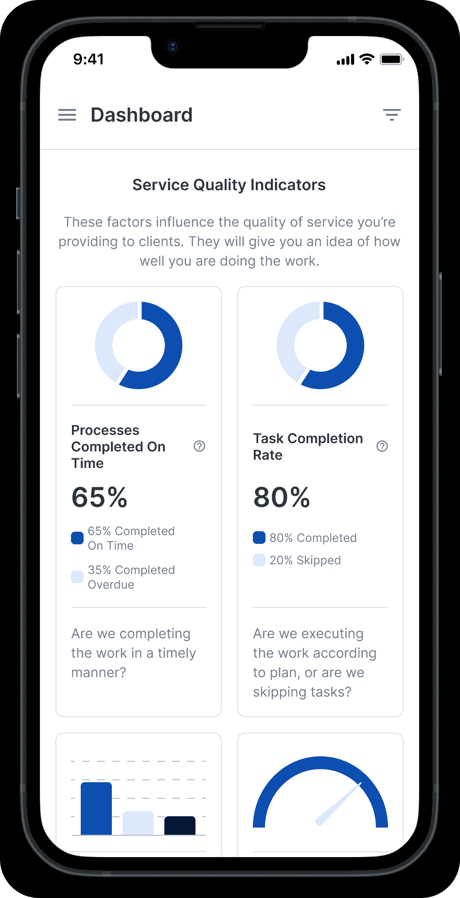
Users could view their process performance data in a trend format to see if they are improving or not.
We had to provide for several states including, new customers without data, loading, and a limited view for non-management employees.
Process Performance gives users a snapshot of how each process is doing. Urgent issues are indicated in red. Potential problems are highlighted in orange.
Team Performance shows the user how each team member is completing the work assigned to them, and calls out any real or potential issues that need to be looked into.
Customer Service gives an overview of response time, support volume, and lets you drill down into the team members who might be improving these metrics or dragging them down.
Launch
I collaborated with Support (responsible for user-facing training documentation) and Marketing to hand off all the technical details to create a successful launch.
The Results
In the following 2 months after the launch, we saw a 55% increase in user engagement in the 8-week cohort of new customers.
Retention of new customers in the 8-week cohort also increased by around 50% following the launch.
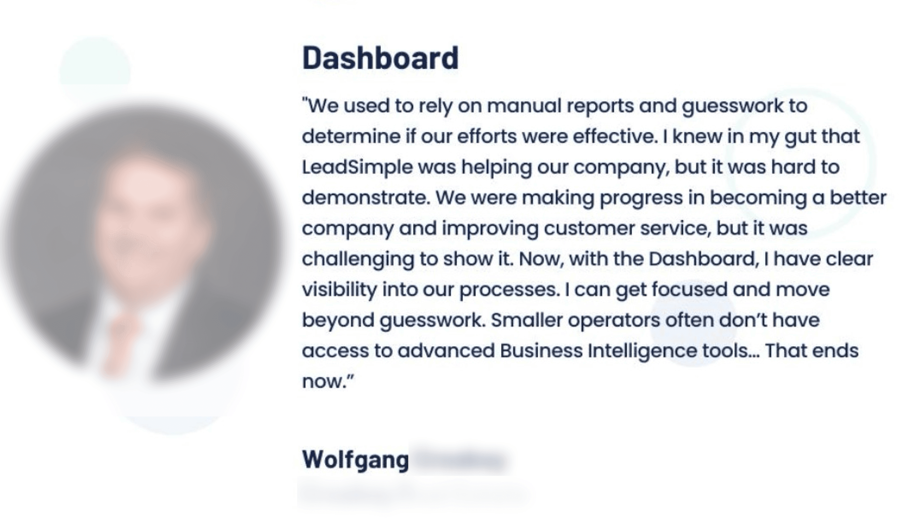
It’s difficult to attribute this exclusively to the dashboard. There were other efforts the company was pursuing to improve retention. But based on the extremely positive customer feedback I believe the dashboard helped us move the needle in the right direction.
